Go into any successful business, whether it is a global manufacturing giant or a fast-growth service company, and you will see one commonality: a steadfast commitment to quality. Not only quality of products, but quality of processes, decisions and customer experience. This total focus is what we call Total Quality Management (TQM).TQM is not a method, it is a culture. It is a mindset in which every employee, from the highest level of management to the shop-floor worker, is responsible for continuous improvement. It moves organizations from reactive problem solving to proactive process control, preventing issues rather than correcting them after the fact.
Complexity is increasing in modern industries especially in sectors like garments, electronics, automotive, services etc. Customers are requesting more. It's a tough competition. In this case, intuition is not enough. Organizations require structured Quality Management Tools to offer clarity, direction and measurable improvements.
This is where tools like:
- Define Phase and Project Charter
- Pareto Analysis
- Affinity Diagram
- Relation Diagram
- Tree Diagram
- PDPC (Process Decision Program Chart)
- Project Management and Leadership techniques
- Basic Statistics
These tools are not stand-alone techniques. They constitute an integrated system to support business excellence. They help teams to spot the right problems, prioritize effectively, analyze root causes, plan systematically, anticipate risks, and make decisions based on data instead of assumptions.
Picture a production floor that is plagued with high defect rates. In the absence of structure, teams may resort to random fixes—adjusting machines, blaming operators, changing methods—without consistent results. Now imagine using TQM tools: defining the problem clearly, analyzing data, prioritizing key defects, structuring improvement actions, and monitoring outcomes statistically.
That is a transformational difference.
- Customer satisfaction
- Continuous improvement
- Process standardization
- Employee involvement
- Data-driven decision making
Real Workplace Insight
In one apparel factory, several attempts at improvement failed for months. Why? Each department worked separately. By using structured TQM tools, starting with a proper Define Phase and Pareto focus, defects fell 38% in just 10 weeks.
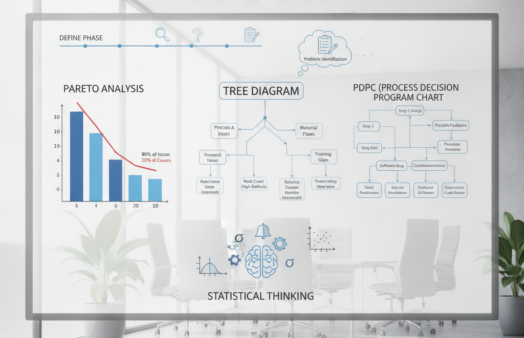
Understanding the Define Phase in Depth
The Define Phase is the foundation of any process improvement effort. It defines the path of the entire project.
The Define Phase is the foundation of any successful Total Quality Management (TQM) or process improvement effort. The main objective is to make sure the team has a good and common understanding of the problem before trying to implement solutions. By defining the issue clearly, organizations can ensure that they do not waste time and resources addressing symptoms rather than the actual cause.
This phase also helps to align all stakeholders, management, project team members and customers, to a common understanding of project objectives, expectations and desired outcomes. One of the critical roles of the Define Phase is to set the scope and boundaries of the project. What is in and out of the improvement effort? This prevents scope creep and helps the team focus on the most relevant areas.
In addition, the Define Phase defines specific, measurable, achievable, relevant and time-bound (SMART) goals, which can be used as a benchmark for measuring project success. By clarifying the problem, aligning stakeholders, defining scope and establishing measurable goals, the Define Phase creates a strong framework for the entire improvement initiative, increasing the likelihood of achieving sustainable results.
If you define the problem incorrectly:
- You solve the wrong issue
- You waste time and budget
- You demotivate teams
Purpose of the Define Phase
- Clarify the problem
- Align stakeholders
- Define scope and boundaries
- Set measurable goals
What Happens in Weak Define Phase?
Let’s take a real situation:
“Defects are high. Reduce defects immediately.”
This is not a defined problem. It lacks:
- Data
- Scope
- Specificity
Compare with:
“Sewing line 3 defect rate increased from 5% to 12% over the past 2 months, primarily during night shift.”
Now this is actionable.
Expert Insight A good Define Phase answers:
- Where?
- When?
- How much?
- Why does it matter?
Project Charter: The Backbone of Improvement
A Project Charter is a document that provides guidance and officially authorizes a project and defines its direction.
A Project Charter is a formal document that gives authority to a project and serves as a guide for the project team. It clearly articulates the purpose, objectives, scope, expected deliverables, timelines and key stakeholders of the project to ensure that everyone involved has a shared understanding of the direction the project is headed. The Project Charter documents the business need, problem statement, goals and responsibilities and helps align the team members and management with a common vision.
It also serves as a benchmark at each stage of the project lifecycle, preventing confusion, managing expectations and ensuring that focus remains on achieving the desired outcomes. The Project Charter is a key tool for quality improvement and TQM initiatives, as it establishes project accountability and sets the foundation for successful implementation.
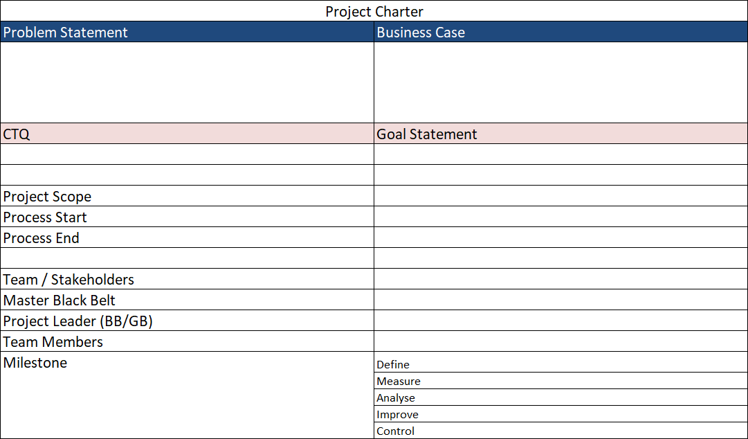
Components of a Strong Project Charter
| Element | Description |
|---|---|
| Problem Statement | Clear, measurable issue |
| Business Case | Why it matters financially |
| Scope | What is included/excluded |
| Goal | SMART objective |
| Timeline | Start–end duration |
| Team | Roles & ownership |
| Expected Benefits | Cost savings, quality |
Common Mistakes in Project Charter
- Too broad scope
- Lack of measurable target
- Ignoring stakeholder input
Worked Example: Project Charter
Scenario
A garment factory experiences repeated returns due to stitching defects.
Problem
Defect rate is 12% vs target 5%
Analysis
- Line affected: Sewing Line 3
- Time trend: Highest during night shift
- Operators mostly new
Results
Root causes suspected: training gaps, machine setup
Improvement Actions
- Define training schedule
- Standardize machine settings
Pareto Analysis
The 80/20 rule ( also called the Pareto Principle ) is that 20 % of the causes lead to about 80 % of the problems / effects. In quality management this principle states that a small number of causes will account for most of the defects, errors, customer complaints, or operational inefficiencies. By identifying the critical few causes and working on them organizations can make big improvements with relatively little effort and resources.
For example, in a garment manufacturing facility, a few defect types like open stitches, uneven hems and oil stains may account for the majority of the rejections of products. Instead of trying to fix all the defects at once, management can use Pareto Analysis to focus on the most important problems. This data driven approach helps organizations to utilize resources, enhance efficiency in solving problems and optimize outcomes of continuous improvement projects.
Concept
The Pareto Principle (80/20 rule) states:
A small number of causes contribute to the majority of problems.
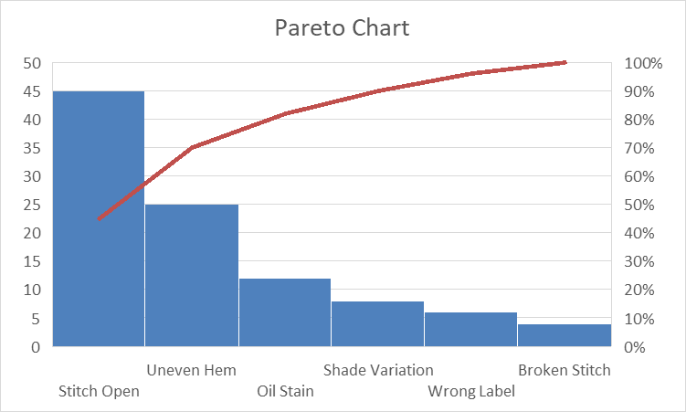
Pareto Table (Given Data)
| Defect | Frequency | Cumulative % |
|---|---|---|
| Stitch Open | 45 | 45% |
| Uneven Hem | 25 | 70% |
| Oil Stain | 12 | 82% |
| Shade Variation | 8 | 90% |
| Wrong Label | 6 | 96% |
| Broken Stitch | 4 | 100% |
Chart Explanation
A Pareto chart combines:
- Bars (frequency)
- Line (cumulative %)
Analysis
- Top 2 defects = 70%
- Key focus: Stitch Open & Uneven Hem
Improvement Actions
- Machine maintenance
- Operator training
- Inspection checkpoints
Best Practice Always focus on “vital few,” not “trivial many.”
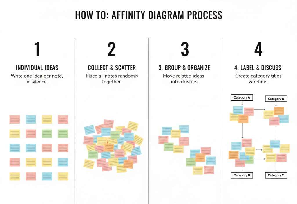
Affinity Diagram
An Affinity Diagram is a quality management and brainstorming tool used to organize a large number of ideas, opinions, issues or data points into logical groups according to their natural relationships. It interprets complex information by identifying common themes and patterns that are not immediately obvious.
Affinity diagrams are useful when you have unstructured information, such as customer feedback, employee suggestions, survey responses, or root cause analysis. For example, by clustering similar ideas, teams can better identify the root causes and direct their improvement efforts to the most important areas.
Usually the process starts with a brainstorming session, and participants write ideas on sticky notes or cards. The ideas are discussed and grouped into categories of similarities, without much discussion. When the groups have been created , each category is assigned a descriptive heading that captures the common theme . This structured approach fosters collaboration, boosts creativity and helps teams achieve consensus more easily.
For instance, a company analyzing customer complaints might group comments such as “late delivery,” “missing shipment updates,” and “lost packages” under Delivery Issues, and complaints like “product defects,” “damaged items,” and “poor packaging” under Product Quality Issues. This organizational structure allows management to immediately see where most focus is needed and to develop specific strategies to improve upon it.
Affinity diagrams are often used in Total Quality Management (TQM), Lean Six Sigma projects, process improvement efforts, and strategic planning sessions because they help to organize many ideas into useful insights that guide decision making and continuous improvement.
Purpose
Organizes large sets of ideas into structured categories.
Example: 20 Customer Complaints
| Category | Complaints |
|---|---|
| Delivery | Late delivery, missed deadlines |
| Quality | Defects, durability issues |
| Service | Poor response, rude staff |
| Pricing | High cost, unclear billing |
Analysis
Grouping reveals patterns and priorities.
Workshop Scenario
Team brainstorms → writes ideas → groups silently → discusses patterns
Challenges
- Bias during grouping
- Dominant voices influencing results
Key Takeaways
- Define Phase ensures clarity
- Pareto prioritizes
- Affinity organizes ideas
Relation Diagram
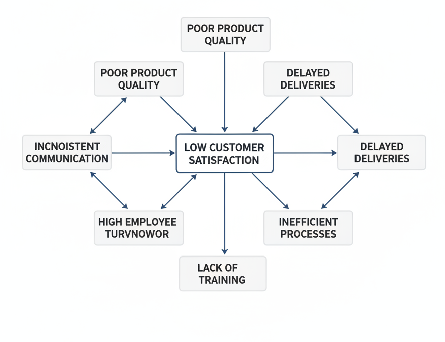
A Relation Diagram is a quality management tool to identify and graphically display the cause-and-effect relationships among different factors in a complex problem or system. A Relation Diagram helps teams to see how multiple factors relate to and affect each other, unlike simple problem solving tools that focus on a single cause. This makes it especially useful for dealing with complicated issues, where many causes and effects are interrelated. By mapping these relationships, organizations can pinpoint the key drivers of a problem and prioritize improvement efforts more effectively.
The diagram consists of listing all the relevant factors related to a problem and then drawing arrows to show the direction of influence between them. Nodes with many outgoing arrows are often thought of as root causes or major drivers of the system . Nodes with many incoming arrows are usually effects . This visualization lets teams separate symptoms from causes and so makes better decisions and solve problems better.
For example, when analyzing high customer complaints in a manufacturing company, factors such as training gaps, poor communication, supplier delays, quality defects and long lead times may all be identified. A Relation Diagram might show that training gaps are a cause of quality defects, which in turn increase customer complaints. Likewise, delays from suppliers can cause delay in production and lengthen lead times which can impact customer satisfaction. These relationships allow management to target the root drivers and not just the symptoms.
Relation Diagrams are commonly used in Total Quality Management (TQM), Lean Six Sigma projects, root cause analysis, and strategic planning because they offer a structured way of understanding complex issues. By uncovering the relationships between different factors, companies can develop better solutions, improve process performance and support continuous improvement initiatives.
Why use it?
Because real-world problems rarely have one cause—they have interconnected factors.
Relationship Table Example
| Factor | Influences |
|---|---|
| Training Gaps | Quality Defects |
| Supplier Delays | Lead Time |
| Lead Time | Customer Complaints |
| Communication Issues | Customer Complaints |
Worked Example
Scenario
High customer complaints in a service company
Problem
Complaints rising monthly
Analysis
- Supplier delays → longer lead time
- Training gaps → quality issues
- Poor communication → customer dissatisfaction
Results
Key drivers:
- Training
- Supplier reliability
Improvement Actions
- Supplier performance tracking
- Staff training programs
Best Practices
- Focus on root drivers
- Limit diagram complexity
Tree Diagram
A Tree Diagram is a planning and problem solving tool that helps to break down a broad objective, goal or problem into a number of smaller, more manageable tasks or actions. It gives a framework to move from a high level concept to specific implementation steps so that teams understand what they need to do to get to a desired outcome. The diagram looks like the branches of a tree . The trunk is the main objective , and the supporting tasks branch out , going into deeper levels of detail .
Tree Diagrams are widely used in Total Quality Management (TQM) for strategic planning, process improvement, goal deployment and decision-making. They help organizations translate high-level goals into concrete plans by identifying the activities, resources, and responsibilities that are needed to succeed. This systematic approach ensures that no important tasks are missed and that improvement activities are aligned with the goals of the organization.
A company, for example, might aim to raise customer satisfaction from 82% to 95%. The team can then use a Tree Diagram to break this objective down into key focus areas such as Product Quality, Delivery Performance, Customer Service and Communication. These areas can then be broken down into specific actions such as: reducing product defects, improving on-time delivery rates, improving employee training and increasing responsiveness to customer feedback. The organization breaks the objective down into granular tasks, delivering an exact roadmap to reach its target.
Tree Diagrams have many advantages such as improved planning, better utilization of resources, better team alignment and clearer accountability. They’re especially helpful for managing complex projects, helping you move from broad goals to specific, measurable actions. Tree Diagrams provide a visual framework for the planning and execution stages, enabling informed decision making and contributing to ongoing improvement and business excellence.
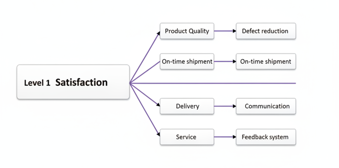
Example Goal
Increase customer satisfaction from 82% to 95%
Hierarchical Table
| Level 1 | Level 2 | Level 3 |
|---|---|---|
| Satisfaction | Product Quality | Defect reduction |
| Delivery | On-time shipment | |
| Service | Staff training | |
| Communication | Feedback system |
Worked Example
Scenario
Customer complaints about delayed shipments
Analysis
Break down delivery issue:
- Scheduling problem
- Logistics issue
- Communication gap
Results
Identified bottlenecks in dispatch planning
Improvement Actions
- Improve scheduling system
- Track shipment status
✅ Common Mistakes
- Too many branches
- Lack of clarity
Process Decision Program Chart (PDPC)-Risk Planning tool
A Process Decision Program Chart (PDPC) is a planning and risk management tool that helps to identify potential problems that could arise during the implementation of a plan and to develop appropriate countermeasures before those problems occur. This enables organizations to predict uncertainties, evaluate possible impediments and develop contingency measures to ensure the success of the project. Unexpected issues can significantly impact the outcome. PDPC is particularly useful in Total Quality Management (TQM), project management, product development and continuous improvement projects.
Normally the PDPC is developed after a plan or Tree Diagram has been created. It starts with the desired objective and the activities required to achieve it. The team then takes each activity and goes through it step by step to determine where it might fail, how bad the failure might be and what to do to prevent or fix the problem. Organizations that consider risks in advance, rather than waiting to react to problems, can reduce disruptions, improve decision making, and increase the likelihood of success in what they do.
One of the major strengths of PDPC is its emphasis on contingency planning. It makes teams think beyond the best case scenario and prepare for potential failures, shortages of resources, delays, technical issues or human errors. This systematic approach enables efficient risk management and allows organizations to act quickly when challenges do present themselves.
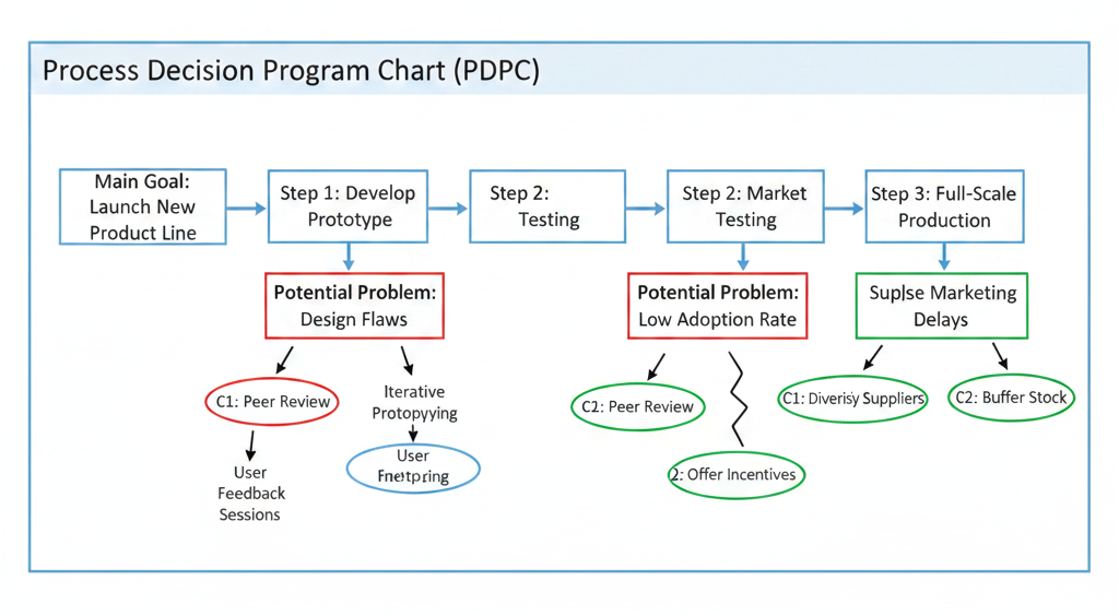
Example: ERP System Implementation Project
A manufacturing company plans to implement a new Enterprise Resource Planning (ERP) system to improve operational efficiency. Before implementation, the project team develops a PDPC to identify potential risks and preventive actions.
| Activity | Potential Problem | Countermeasure |
|---|---|---|
| Employee Training | Low attendance | Schedule multiple training sessions |
| Data Migration | Data errors or loss | Conduct data validation and backups |
| System Testing | Incomplete testing | Create comprehensive test plans |
| Go-Live | System downtime | Prepare backup servers and support team |
| User Adoption | Resistance to change | Conduct awareness and communication programs |
PDPC Analysis
The PDPC indicates some risks that could delay or jeopardize the ERP implementation. For instance, employees that do not attend the training sessions will not be able to use the new system effectively leading to a loss of productivity. Similarly, data migration errors can impact business operations and lead to inaccurate reporting. By recognizing these risks ahead of time and developing countermeasures, the organization can reduce disruptions and improve project results.
Benefits of PDPC
- Anticipates potential problems before implementation.
- Supports proactive risk management.
- Improves project planning and preparedness.
- Reduces implementation failures and delays.
- Enhances decision-making and contingency planning.
- Increases the likelihood of achieving project objectives.
Best Practices for Using PDPC
- Involve cross-functional teams during risk identification.
- Consider both technical and human-related risks.
- Prioritize high-impact and high-probability issues.
- Develop realistic and actionable countermeasures.
- Regularly review and update the PDPC as the project progresses.
In conclusion, the Process Decision Program Chart (PDPC) is an effective planning tool for organizations to analyze risks, develop contingency plans, and improve the success rate of projects and improvement initiatives. By identifying potential obstacles before implementation begins, teams can take preventive action, reduce uncertainty and achieve more reliable and sustainable results.
Worked Example
Scenario
ERP implementation project
Analysis
- Risk: user resistance
- Risk: data migration errors
Results
Identified critical risks early
Improvement Actions
- Backup plans
- Training sessions
- Emergency IT support
✅ Practical Tip Always prepare contingency plans for high-risk steps.
Project Management and Leadership
Projects Fail Due to Leadership, Not Tools
Even the best tools fail without:
- Communication
- Ownership
- Motivation
DMAIC Timeline Example
| Phase | Duration |
|---|---|
| Define | 2 Weeks |
| Measure | 3 Weeks |
| Analyze | 2 Weeks |
| Improve | 4 Weeks |
| Control | 2 Weeks |
RACI Matrix (Expanded)
| Task | Production | Quality | IE | Management |
|---|---|---|---|---|
| Data Collection | R | A | C | I |
| Analysis | C | R | A | I |
| Implementation | R | A | C | I |
Case Study: Defect Reduction
Goal
Reduce defects by 30%
Challenges
- Operator resistance
- Communication gaps
- Low morale
Leadership Actions
- Daily 10-minute meetings
- Visual dashboards
- Recognition programs
✅ Key Leadership Skills
- Emotional intelligence
- Conflict resolution
- Coaching mindset
✅ Reality Check
A weak leader can destroy a strong project.
A strong leader can save a weak project.
Key Leadership Skills
- Emotional intelligence
- Decision making
- Coaching
- Change management
✅ Did You Know?
Projects fail more often due to leadership issues than technical problems.
Building a True Quality Culture
When you step back and look at all these modules together, something powerful emerges.
This is not just a collection of tools—it is a complete system for transformation.
- The Define Phase ensures clarity and purpose.
- Pareto Analysis and Affinity Diagram bring focus and structure.
- Relation and Tree Diagrams provide depth and direction.
- PDPC ensures resilience against failure.
- Project Management and Leadership drive execution.
- Basic Statistics bring objectivity and precision.
The Bigger Picture
Organizations that succeed in today’s world:
- Don’t rely on intuition alone
- Don’t fix problems randomly
- Don’t operate in silos
They:
- Use structured quality management tools
- Build cross-functional collaboration
- Develop strong leadership
- Make decisions using data
✅ Final Thought for Professionals
Quality is not inspected into a product—it is designed into the process.
If you consistently apply these tools:
- Problems will reduce
- Processes will stabilize
- Teams will align
- Customers will trust you
And ultimately, your organization will move closer to sustainable business excellence.